Responsive design is all about creating websites that effortlessly adjust to any screen size, from the tiniest smartphone to the largest desktop monitor. Wondering why is responsive design so important in today’s web development? Well, it’s the secret sauce behind those sites that look flawless whether you’re on your phone or your laptop. Think of it as the chameleon of web design—always adapting. When you work with an IT service provider, they’ll often recommend this flexible approach to keep users happy no matter how they access the site.
But wait, there’s adaptive design too, right? Yep! The key difference is while responsive design fluidly resizes across devices, adaptive design sticks to specific screen sizes, loading different versions depending on your device. Both work, but responsive design is like that all-in-one solution that just fits—no matter what. Expect to dive deeper into the benefits of responsive design, and yes, we’ll cover how web design services can make your life so much easier.
Now, ready to find out why responsive design is a must for web development in 2024? Let’s get into it!
Why is Responsive Design so Important in 2024?
In 2024, having a website that isn’t responsive is like trying to fit into shoes two sizes too small—painful and unnecessary! But seriously, why is responsive design so important? Simple: people are hopping between devices all day, from scrolling on their phones to working on their laptops. Your website needs to keep up. A responsive design makes sure it looks great and works smoothly no matter where it’s viewed, giving your users an experience that feels just right, every time.
Web Design Evolution:
Let’s take a trip down memory lane. The very first web page ever? It was published by Sir Tim Berners-Lee in 1991 and was, well… basic—just text and links. No images, no fancy layouts. But hey, it was a start! Fast forward to now, and web design has come a long way from those plain beginnings.
Today, the real question is, what is the purpose of responsive web design? It’s to ensure that no matter what device people use, your site looks polished and works like a charm. This is where the benefits of responsive web design really shine, from basic HTML to fully interactive, dynamic experiences, websites today are expected to look amazing and function seamlessly on any device. Think about it: your favourite apps and websites wouldn’t be nearly as fun if they didn’t work smoothly on all your devices!
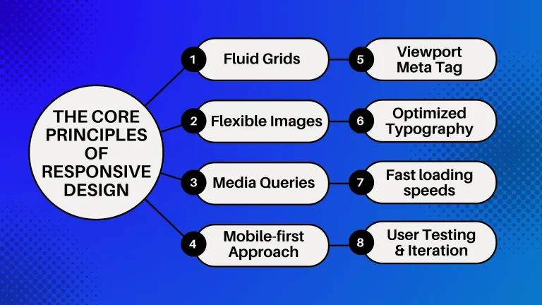
The Core Principles of Responsive Design:
Responsive design follows a few core principles that make it a game-changer in the web world. First up is flexibility—your site adjusts to every screen size. Then there’s fluid grids, which help your layout scale smoothly. Flexible images? They resize like magic. Media queries allow different styles for different devices, while minimalism keeps things clean and clutter-free. Touch-friendly elements make sure your site is easy to use on mobile. Performance is key, so fast loading times are a must. And last but not least, consistency across all platforms. These are just a few advantages of responsive web design that ensures to create a seamless, user-friendly experience no matter how people access your site.
How Responsive Design Improves Accessibility for a Better User Experience?
User experience is everything. It’s what keeps people coming back—or running for the exit! A smooth, enjoyable experience means visitors can navigate your site effortlessly, find what they need, and stick around longer. So, why is responsive design so important for accessibility? It ensures that your website works seamlessly for everyone, whether they’re on a phone, tablet, or desktop. And with accessibility being one of the key phases of the web development process, it’s crucial to get it right!
Prioritising the Needs of Your Mobile Audience:
Let’s be real—mobile users are where it’s at! With more people browsing on their phones than desktops worldwide, it’s a no-brainer to put mobile first. That’s where mobile-first design comes in. It’s all about optimising your site for mobile devices first, then scaling up for those larger screens like laptops and desktops. Developers and designers are all over this approach because, well, we live in a mobile-driven world. Oh, and why responsive web design is good for SEO? It is simple: search engines love mobile-friendly sites, meaning better rankings and more eyes on your content!
Seamless Navigation Across Devices:
Imagine visiting a website on your phone, and it looks amazing—then you switch to your laptop, and it’s just as smooth. That’s the magic of seamless navigation across devices. It ensures a consistent experience no matter how users access your site, which keeps them happy and engaged. And let’s face it, a happy user is more likely to stick around. Adopting responsive web design for your business guarantees that your site looks great and functions exceptionally on any device, boosting both user satisfaction and your brand’s credibility.